

Обучението по математика е процес и в него участват активно две страни - учител и ученик. Не е възможно да научиш някого на нещо, ако той самият не желае това. Read the Full Story
Авторите на сайта са любители на екскурзиите и природата, работещи хора в активна възраст, с възможност да пътуват. Read the Full Story
Мисъл на деня
.
Всеки, който предложи да направи нещо добро, не трябва да очаква хората да хвърлят камъни по пътя му, а трябва да приеме съдбата си спокойно, дори ако хвърлят камъни по него.
Търсене в сайта
 Примерно съдържание Demo Articles
Образование новини
Demo Articles
Menu Types
Please click the links in the list below to load the various menu types.
- Fusion Menu - Fusion Menu, an advanced dropdown based CSS menu. It supports both Mootools powered transition and animation enhancements for its dropdown.
- SplitMenu - A static menu system that displays submenu items outside of the main horizontal menu, 2nd level beneath the main menu bar (in the navigation position) and the 3rd in the side column.
- No Menu - This option disables the inbuilt menu system in its entirety. As the menu is supplanted into a module position via Gantry, when the menu is disabled, you can continue to use the position as normal.
Fusion Menu
Fusion is javascript-based dropdown menu system, with extensive functionality. The menu itself is built on the rewritten core of the latest revision of RokNavMenu, the core application behind all RocketTheme menus.
Fusion offers a series of new abilities ranging from Menu Icons, Subtext support and much greater controls over the Multiple Column ability for dropdowns.
Menu Icons
To setup a Menu Icon, go to Menu → Mainmenu → Select/Create a Menu Item. Locate the Menu Image field in Parameters (Template theme - gantry-fusion) and select an image from the dropdown.
Subtext
Subtext is the term used to describe the secondary text placed underneath the menu title.
To add your own Subtext, go to Menu → Mainmenu → Select/Create a Menu Item. Locate the Subtext field in Parameters (Template theme - gantry-fusion) and insert your desired text. Also add your Subtext to the Parameters (Template theme - gantry-suckerfish) field so it appears in IE6.
Multiple Dropdown Columns
Fusion has the facility for dynamic column control for its dropdown. You can choose between single (1) or double (2) column modes for children of every single menu item via configuration.
To control the number of columns of each menu item, go to Menu → Mainmenu → Select/Create a Menu Item. Locate the Columns of Children field in Parameters (Template theme - gantry-fusion) and choose either 1 or 2.
Dynamic Child Direction
Typically, a dropdown menu column will extend beyond the width of the browser window if you have enough child levels. However, with Fusion, the menu detects the width of the browser and will change the direction of menu pullouts so all menu items are visible without the need to scroll.
Splitmenu
A static menu system that displays submenu items outside of the main horizontal menu. 2nd level menu items are displayed beneath the main menu bar (header-d) in the navigation position with all further sublevel items displaying in the Sidebar.
How to create Child / Sublevel menu items in Joomla
In order for menu dropdowns in Moomenu and Suckerfish, and the dropline / side column items of Splitmenu to appear, you need to setup parent and child menu items.
- Login into the Joomla administrator
- Go to Menu → Menu Name
- Select a menu item that you wish to be in the dropdown
- Locate the Parent Item form
- Select the menu item that you wish for your item to appear under
- Save
Perform the same task for all menu items that you wish to be child items.
The RokCandy component is required for the syntax below to work.
All syntax below uses RokCandy, the content macro extension for Joomla. RokCandy converts simple, understandable and pre-defined syntax to complex HTML constructions.
If you wish to view the typography page, showing how to setup the various typography elements with HTML, then please go to the HTML Typography page.
If you would like to read more detailed information on inserting the included typography into your content, check out the Typography Tutorial.
[componentheading]This is a ComponentHeading[/componentheading]Praesent rutrum sapien ac felis. Phasellus elementum dolor quis turpis. Vestibulum nec mi vitae pede tincidunt nonummy. Vestibulum facilisis mollis neque. Sed orci. Cum sociis natoque penatibus et magnis dis parturient montes, nascetur ridiculus mus. Sed euismod magna a nibh.
[contentheading]This is a ContentHeading[/contentheading]Proin ac nunc eu nunc condimentum accumsan. Phasellus odio justo, euismod vitae, egestas a, porttitor in, urna. Maecenas vitae mauris. Donec vestibulum, nunc eu varius pharetra, massa est sagittis odio, sit amet eleifend elit dolor id tortor.
[h1]This is an H1 Header[/h1]Lorem ipsum dolor sit amet, consectetuer adipiscing elit. Proin sit amet odio quis sapien molestie ultrices. Vivamus quis lectus. Praesent eu mi. Curabitur pharetra leo sed nisl. Nunc vel nisi. Aliquam nulla. Etiam at est. Pellentesque arcu diam, tempus nec, sodales eu, ullamcorper quis, risus.
[h2]This is an H2 Header[/h2]Proin ac nunc eu nunc condimentum accumsan. Phasellus odio justo, euismod vitae, egestas a, porttitor in, urna. Maecenas vitae mauris. Donec vestibulum, nunc eu varius pharetra, massa est sagittis odio, sit amet eleifend elit dolor id tortor.
[h3]This is an H3 Header[/h3]Mauris euismod. In ac massa vitae quam tincidunt dapibus. Ut at tortor nec mi mattis blandit. Maecenas venenatis lorem at nulla. Phasellus a libero. Sed odio odio, eleifend dignissim, feugiat vel, tempor nec, ligula. Suspendisse lacinia convallis nulla. Vestibulum posuere, lacus aliquet pulvinar faucibus, tortor urna luctus diam, vitae ultrices ante magna non tellus.
[h4]This is an H4 Header[/h4]Mauris euismod. In ac massa vitae quam tincidunt dapibus. Ut at tortor nec mi mattis blandit. Maecenas venenatis lorem at nulla. Phasellus a libero. Sed odio odio, eleifend dignissim, feugiat vel, tempor nec, ligula. Suspendisse lacinia convallis nulla. Vestibulum posuere, lacus aliquet pulvinar faucibus, tortor urna luctus diam, vitae ultrices ante magna non tellus.
[h5]This is an H5 Header[/h5]Mauris euismod. In ac massa vitae quam tincidunt dapibus. Ut at tortor nec mi mattis blandit. Maecenas venenatis lorem at nulla. Phasellus a libero. Sed odio odio, eleifend dignissim, feugiat vel, tempor nec, ligula. Suspendisse lacinia convallis nulla. Vestibulum posuere, lacus aliquet pulvinar faucibus, tortor urna luctus diam, vitae ultrices ante magna non tellus.
[h3]Blockquote Styles[/h3] [blockquote]This is a blockquote, you will want to use the following formatting: [blockquote]....[/blockquote]Praesent rutrum sapien ac felis. Phasellus elementum dolor quis turpis. Vestibulum nec mi vitae pede tincidunt nonummy. Vestibulum facilisis mollis neque. Sed orci. Cum sociis natoque penatibus et magnis dis parturient montes, nascetur ridiculus mus. Sed euismod magna a nibh.[/blockquote] [h3]DropCap Styles[/h3] [dropcap cap="P"]Praesent rutrum sapien ac felis. Phasellus elementum dolor quis turpis. Vestibulum nec mi vitae pede tincidunt nonummy. Vestibulum facilisis mollis neque. Sed orci. Cum sociis natoque penatibus et magnis dis parturient montes, nascetur ridiculus mus. Sed euismod magna a nibh. Praesent rutrum sapien ac felis. Phasellus elementum dolor quis turpis. Vestibulum nec mi vitae pede tincidunt nonummy. Vestibulum facilisis mollis neque. Sed orci. Cum sociis natoque penatibus et magnis dis parturient montes, nascetur ridiculus mus. Sed euismod magna a nibh.You will need to use the following formatting: [dropcap cap="P"]...some content...[/dropcap][/dropcap] [dropcap cap="1"]You will need to use the following formatting: [dropcap cap="1"]...some content...[/dropcap][/dropcap] [dropcap cap="2"]You will need to use the following formatting: [dropcap cap="2"]...some content...[/dropcap][/dropcap] [dropcap cap="3"]You will need to use the following formatting: [dropcap cap="3"]...some content...[/dropcap][/dropcap] [h3]List Styles - Bullets[/h3]
Below is a list with bullets. To use this style create a list in the following format: [list class=class name][li]....[/li][li....[/li][/list]
[list class="bullet-1"][li]To use this style create a list in the following format: [list class="bullet-1"][li]...[/li][li]...[/li][/list].[/li][li]To use this style create a list in the following format: [list class="bullet-1"][li]...[/li][li]...[/li][/list].[/li][/list][list class="bullet-2"][li]To use this style create a list in the following format: [list class="bullet-2"][li]...[/li][li]...[/li][/list].[/li][li]To use this style create a list in the following format: [list class="bullet-2"][li]...[/li][li]...[/li][/list].[/li][/list]
[list class="bullet-3"][li]To use this style create a list in the following format: [list class="bullet-3"][li]...[/li][li]...[/li][/list].[/li][li]To use this style create a list in the following format: [list class="bullet-3"][li]...[/li][li]...[/li][/list].[/li][/list]
[list class="bullet-4"][li]To use this style create a list in the following format: [list class="bullet-4"][li]...[/li][li]...[/li][/list].[/li][li]To use this style create a list in the following format: [list class="bullet-4"][li]...[/li][li]...[/li][/list].[/li][/list]
[list class="bullet-5"][li]To use this style create a list in the following format: [list class="bullet-5"][li]...[/li][li]...[/li][/list].[/li][li]To use this style create a list in the following format: [list class="bullet-5"][li]...[/li][li]...[/li][/list].[/li][/list]
[list class="bullet-6"][li]To use this style create a list in the following format: [list class="bullet-6"][li]...[/li][li]...[/li][/list].[/li][li]To use this style create a list in the following format: [list class="bullet-6"][li]...[/li][li]...[/li][/list].[/li][/list]
[list class="bullet-7"][li]To use this style create a list in the following format: [list class="bullet-7"][li]...[/li][li]...[/li][/list].[/li][li]To use this style create a list in the following format: [list class="bullet-7"][li]...[/li][li]...[/li][/list].[/li][/list]
[list class="bullet-8"][li]To use this style create a list in the following format: [list class="bullet-8"][li]...[/li][li]...[/li][/list].[/li][li]To use this style create a list in the following format: [list class="bullet-8"][li]...[/li][li]...[/li][/list].[/li][/list]
[list class="bullet-9"][li]To use this style create a list in the following format: [list class="bullet-9"][li]...[/li][li]...[/li][/list].[/li][li]To use this style create a list in the following format: [list class="bullet-9"][li]...[/li][li]...[/li][/list].[/li][/list] [h3]Emphasis Styles[/h3] This is a span that allows you to [emphasis]highlight words or phrases[/emphasis]. Use the following format: [emphasis] ... some content ... [/emphasis]
This is a span that allows you to [emphasisbold]highlight words or phrases[/emphasisbold]. Use the following format: [emphasisbold] ... some content .... [/emphasisbold]
[h3]Inset Styles[/h3]
Praesent rutrum sapien ac felis. Phasellus elementum dolor quis turpis. Vestibulum nec mi vitae pede tincidunt nonummy. Vestibulum facilisis mollis neque. Sed orci. Cum sociis natoque penatibus et magnis dis parturient montes, nascetur ridiculus mus.[inset side="right" title="Inset Right Title"]You will need to use the following formatting: [inset side="right" title="Inset Right Title"] ... some content ...[/inset][/inset]Vestibulum facilisis mollis neque. Sed orci. Cum sociis natoque penatibus et magnis dis parturient montes, nascetur ridiculus mus. Sed euismod magna a nibh.
Praesent rutrum sapien ac felis. Phasellus elementum dolor quis turpis. Vestibulum nec mi vitae pede tincidunt nonummy. Vestibulum facilisis mollis neque. Sed orci. Cum sociis natoque penatibus et magnis dis parturient montes, nascetur ridiculus mus.[inset side="left" title="Inset Left Title"]You will need to use the following formatting: [inset side="left" title="Inset Left Title"] ... some content ...[/inset][/inset]Vestibulum facilisis mollis neque. Sed orci. Cum sociis natoque penatibus et magnis dis parturient montes, nascetur ridiculus mus. Sed euismod magna a nibh.
Sed euismod magna a nibh. Praesent rutrum sapien ac felis. Phasellus elementum dolor quis turpis. Vestibulum nec mi vitae pede tincidunt nonummy. Praesent rutrum sapien ac felis. Phasellus elementum dolor quis turpis. Vestibulum nec mi vitae pede tincidunt nonummy. Vestibulum facilisis mollis neque. Sed orci. Cum sociis natoque penatibus et magnis dis parturient montes, nascetur ridiculus mus.Praesent rutrum sapien ac felis. Phasellus elementum dolor quis turpis. Vestibulum nec mi vitae pede tincidunt nonummy. Vestibulum facilisis mollis neque. Sed orci. Cum sociis natoque penatibus et magnis dis parturient montes, nascetur ridiculus mus.
[h3]Important Emphasis Styles[/h3] [important title="Sample Title"]This is a span that lets you place all of the content into a nice well formed section. You will need to use the following formatting: [important title="Sample Title"]...some content[/important][/important]
[h3]Notice Styles[/h3] [div class="alert" class2="typo-icon"]This is a sample of the 'alert' style. Use this style to denote very important information to your users. To use this use the following syntax: [div class="alert" class2="typo-icon"] ...some content.... [/div][/div] [div class="approved" class2="typo-icon"]This is a sample of the 'approved' style. Use this style to denote very important information to your users. To use this use the following syntax: [div class="approved" class2="typo-icon"] ...some content.... [/div][/div] [div class="attention" class2="typo-icon"]This is a sample of the 'attention' style. Use this style to denote very important information to your users. To use this use the following syntax: [div class="attention" class2="typo-icon"] ...some content.... [/div][/div] [div class="camera" class2="typo-icon"]This is a sample of the 'camera' style. Use this style to denote very important information to your users. To use this use the following syntax: [div class="camera" class2="typo-icon"] ...some content.... [/div][/div] [div class="cart" class2="typo-icon"]This is a sample of the 'cart' style. Use this style to denote very important information to your users. To use this use the following syntax: [div class="cart" class2="typo-icon"] ...some content.... [/div][/div] [div class="doc" class2="typo-icon"]This is a sample of the 'doc' style. Use this style to denote very important information to your users. To use this use the following syntax: [div class="doc" class2="typo-icon"] ...some content.... [/div][/div] [div class="download" class2="typo-icon"]This is a sample of the 'download' style. Use this style to denote very important information to your users. To use this use the following syntax: [div class="download" class2="typo-icon"] ...some content.... [/div][/div] [div class="media" class2="typo-icon"]This is a sample of the 'media' style. Use this style to denote very important information to your users. To use this use the following syntax: [div class="media" class2="typo-icon"] ...some content.... [/div][/div] [div class="note" class2="typo-icon"]This is a sample of the 'note' style. Use this style to denote very important information to your users. To use this use the following syntax: [div class="note" class2="typo-icon"] ...some content.... [/div][/div] [div class="notice" class2="typo-icon"]This is a sample of the 'notice' style. Use this style to denote very important information to your users. To use this use the following syntax: [div class="notice" class2="typo-icon"] ...some content.... [/div][/div] [div3 class="quote" class2="quote-l" class3="quote-r"]This is a sample of the 'quote' style. Use this style to denote very important information to your users. To use this use the following syntax: [div3 class="quote" class2="quote-l" class3="quote-r"] ...some content.... [/div3][/div3] [h3]Pre Example[/h3] [pre] This is a sample [pre] ... [/pre] tag: div.modulebox-black div.bx1 { background: url(../images/black/box_bl.png) 0 100% no-repeat; } div.modulebox-black div.bx2 { background: url(../images/black/box_tr.png) 100% 0 no-repeat; } div.modulebox-black div.bx3 { background: url(../images/black/box_tl.png) 0 0 no-repeat; padding: 0; margin: 0; } [/pre]
This tutorial page features all the typography available with the template, showcasing them in HTML form. If you wish to use the RokCandy format, which is WYSIWYG friendly, please go to the RokCandy Typography page.
This page shows all of the typography styles and settings in action. If you would like to read more detailed information on inserting the included typography into your content, check out the Typography Tutorial.
This is a ComponentHeading
Praesent rutrum sapien ac felis. Phasellus elementum dolor quis turpis. Vestibulum nec mi vitae pede tincidunt nonummy. Vestibulum facilisis mollis neque. Sed orci. Cum sociis natoque penatibus et magnis dis parturient montes, nascetur ridiculus mus. Sed euismod magna a nibh.
Proin ac nunc eu nunc condimentum accumsan. Phasellus odio justo, euismod vitae, egestas a, porttitor in, urna. Maecenas vitae mauris. Donec vestibulum, nunc eu varius pharetra, massa est sagittis odio, sit amet eleifend elit dolor id tortor.
This is a H1 Header
Lorem ipsum dolor sit amet, consectetuer adipiscing elit. Proin sit amet odio quis sapien molestie ultrices. Vivamus quis lectus. Praesent eu mi. Curabitur pharetra leo sed nisl. Nunc vel nisi. Aliquam nulla. Etiam at est. Pellentesque arcu diam, tempus nec, sodales eu, ullamcorper quis, risus.
This is a H2 Header
Proin ac nunc eu nunc condimentum accumsan. Phasellus odio justo, euismod vitae, egestas a, porttitor in, urna. Maecenas vitae mauris. Donec vestibulum, nunc eu varius pharetra, massa est sagittis odio, sit amet eleifend elit dolor id tortor.
This is a H3 Header
Mauris euismod. In ac massa vitae quam tincidunt dapibus. Ut at tortor nec mi mattis blandit. Maecenas venenatis lorem at nulla. Phasellus a libero. Sed odio odio, eleifend dignissim, feugiat vel, tempor nec, ligula. Suspendisse lacinia convallis nulla.
This is a H4 Header
Vestibulum posuere, lacus aliquet pulvinar faucibus, tortor urna luctus diam, vitae ultrices ante magna non tellus. Donec nunc magna, posuere eget, aliquam in, vulputate in, lacus. Sed venenatis. Donec nec dolor vitae mauris dapibus ullamcorper. Etiam iaculis mollis tortor.
This is a H5 Header
Pellentesque vel enim urna, sit amet blandit ipsum. Maecenas quis sem sit amet nunc pretium mattis. Sed dapibus semper est, sed pretium erat sodales sed. Aenean hendrerit fringilla sem, et tincidunt libero ornare at. Sed venenatis pretium mauris sed vehicula.
Blockquote Example
This is a blockquote, you will want to use the following formatting: <blockquote><p>....</p></blockquote>. Praesent rutrum sapien ac felis. Phasellus elementum dolor quis turpis. Vestibulum nec mi vitae pede tincidunt nonummy. Vestibulum facilisis mollis neque. Sed orci. Cum sociis natoque penatibus et magnis dis parturient montes, nascetur ridiculus mus. Sed euismod magna a nibh.
DropCap Styles
PPraesent rutrum sapien ac felis. Phasellus elementum dolor quis turpis. Vestibulum nec mi vitae pede tincidunt nonummy. Vestibulum facilisis mollis neque. Sed orci. Cum sociis natoque penatibus et magnis dis parturient montes, nascetur ridiculus mus. Sed euismod magna a nibh.
You will need to use the following formatting: <p class="dropcap"><span class="dropcap">P</span></p>
Number Examples
1You will need to use the following formatting: <p class="dropcap"><span class="dropcap">1</span></p>
2You will need to use the following formatting: <p class="dropcap"><span class="dropcap">2</span></p>
3You will need to use the following formatting: <p class="dropcap"><span class="dropcap">3</span></p>
List Styles - Bullets
Below is a list with bullets. To use this style create a list in the following format: <ul class="class name"><li>....</li><li>....</li>...</ul>
- To use this style create a list in the following format: <ul class="bullet-1"><li>....</li><li>....</li>...</ul>.
- To use this style create a list in the following format: <ul class="bullet-1"><li>....</li><li>....</li>...</ul>.
- To use this style create a list in the following format: <ul class="bullet-2"><li>....</li><li>....</li>...</ul>.
- To use this style create a list in the following format: <ul class="bullet-2"><li>....</li><li>....</li>...</ul>.
- To use this style create a list in the following format: <ul class="bullet-3"><li>....</li><li>....</li>...</ul>.
- To use this style create a list in the following format: <ul class="bullet-3"><li>....</li><li>....</li>...</ul>.
- To use this style create a list in the following format: <ul class="bullet-4"><li>....</li><li>....</li>...</ul>.
- To use this style create a list in the following format: <ul class="bullet-4"><li>....</li><li>....</li>...</ul>.
- To use this style create a list in the following format: <ul class="bullet-5"><li>....</li><li>....</li>...</ul>.
- To use this style create a list in the following format: <ul class="bullet-5"><li>....</li><li>....</li>...</ul>.
- To use this style create a list in the following format: <ul class="bullet-6"><li>....</li><li>....</li>...</ul>.
- To use this style create a list in the following format: <ul class="bullet-6"><li>....</li><li>....</li>...</ul>.
- To use this style create a list in the following format: <ul class="bullet-7"><li>....</li><li>....</li>...</ul>.
- To use this style create a list in the following format: <ul class="bullet-7"><li>....</li><li>....</li>...</ul>.
- To use this style create a list in the following format: <ul class="bullet-8"><li>....</li><li>....</li>...</ul>.
- To use this style create a list in the following format: <ul class="bullet-8"><li>....</li><li>....</li>...</ul>.
- To use this style create a list in the following format: <ul class="bullet-9"><li>....</li><li>....</li>...</ul>.
- To use this style create a list in the following format: <ul class="bullet-9"><li>....</li><li>....</li>...</ul>.
Emphasis Styles
This is a emphasis tag that allows you to highlight words or phrases. Use the following format: <em class="color">...</em>This is a emphasis tag that allows you to highlight words or phrases. Use the following format: <em class="bold">...</em>
Inset Styles
Praesent rutrum sapien ac felis. Phasellus elementum dolor quis turpis. Vestibulum nec mi vitae pede tincidunt nonummy. Vestibulum facilisis mollis neque. Sed orci. Cum sociis natoque penatibus et magnis dis parturient montes, nascetur ridiculus mus.Inset Right TitleYou will need to use the following formatting: <span class="inset-right"><span class="inset-right-title">....</span> ... some content ... </strong>Vestibulum facilisis mollis neque. Sed orci. Cum sociis natoque penatibus et magnis dis parturient montes, nascetur ridiculus mus. Sed euismod magna a nibh.
Praesent rutrum sapien ac felis. Phasellus elementum dolor quis turpis. Vestibulum nec mi vitae pede tincidunt nonummy. Vestibulum facilisis mollis neque. Sed orci. Cum sociis natoque penatibus et magnis dis parturient montes, nascetur ridiculus mus.Inset Left TitleYou will need to use the following formatting: <span class="inset-left"><span class="inset-left-title">....</span> ... some content ... </span>Vestibulum facilisis mollis neque. Sed orci. Cum sociis natoque penatibus et magnis dis parturient montes, nascetur ridiculus mus. Sed euismod magna a nibh.
Sed euismod magna a nibh. Praesent rutrum sapien ac felis. Phasellus elementum dolor quis turpis. Vestibulum nec mi vitae pede tincidunt nonummy. Praesent rutrum sapien ac felis. Phasellus elementum dolor quis turpis. Vestibulum nec mi vitae pede tincidunt nonummy. Vestibulum facilisis mollis neque. Sed orci. Cum sociis natoque penatibus et magnis dis parturient montes, nascetur ridiculus mus.Praesent rutrum sapien ac felis. Phasellus elementum dolor quis turpis. Vestibulum nec mi vitae pede tincidunt nonummy. Vestibulum facilisis mollis neque. Sed orci. Cum sociis natoque penatibus et magnis dis parturient montes, nascetur ridiculus mus.
Important Emphasis Styles
Notice Styles
Pre Example
This is a sample <pre>...</pre> tag:

div.modulebox-black div.bx1 {
  background: url(../images/black/box_bl.png) 0 100% no-repeat;
}

div.modulebox-black div.bx2 {
  background: url(../images/black/box_tr.png) 100% 0 no-repeat;
}

div.modulebox-black div.bx3 {
  background: url(../images/black/box_tl.png) 0 0 no-repeat;
  padding: 0;
  margin: 0;
}
Typography is a fundamental part of a template, providing you with the tools to characterise your content and bring it to life. There is a vast array of typography available with this template, as is with our previous releases, from list styles, notice blocks and a diverse number of other elements.
There are 2 methods in which to implement the typography into your Joomla content:
- HTML Mode: This is the traditional approach for implementing typography as used in the pre-2009 templates / demos, where you had to use HTML coding / syntax for the typography. This presents two main problems: the Joomla WYSIWYG editor is notorious for stripping out HTML so could easily remove your formatted article and no typography; secondly, using HTML for typography may present a problem for certain users who are unaccustomed to HTML and coding.
- RokCandy Mode: The RokCandy component from RocketTheme allows you to implement typography easily, without fear of the WYSIWYG editor ruining your formatting and allows you, and/or your clients to add them to your content with ease. This is through a method similar to BBcode (as seen in a forum). WYSIWYG friendly syntax can be used, or even custom configured that will transform a set snippet to the correct HTML when it is parsed by Joomla.
Why use RokCandy?
RokCandy is the ideal solution for those with limited coding skills or those who implement our templates for their clients. It is free from the WYSIWYG editors horrific filtering habits and can be easily pre-configured for your personal needs or the needs of your client.
[readon url="index.php?option=com_content&view=article&id=53&Itemid=60"]RokCandy Typography[/readon]RokCandy Example
The RokCandy Typography button is created by using the following syntax with RokCandy:
[readon url="/typography/rokcandy-examples"]RokCandy Typography[/readon]
However, if we were to use HTML, the following code would be required:
<p class="rt-readon-surround">
  <a class="readon" href="/typography/rokcandy-examples">
    <span>Read more...</span>
  </a>
</p>
As you can see, the RokCandy version is a lot easier to use.
There are over 60 collapsible module positions. If no module is published to a position, it will not appear, collapsing the entire area.
Non-Standard Elements
There are non-standard elements that are injected into the template grid structure when enabled via the template parameter.
For example: The logo element is injected into the header-a position. It is inserted in a stacked fashion, meaning, if there are modules published to the header-a position, they will appear in the same column as the logo, just one place below.
You can change the positions of these elements at Extensions → Template Manager → rt_kinetic_j15
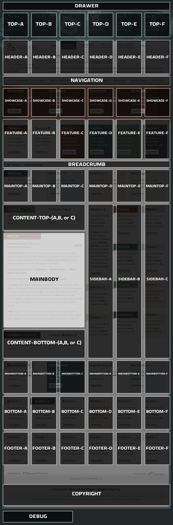
[readon url="index.php?option=com_content&view=article&id=47&Itemid=54"]Gantry Framework : Learn more[/readon]The below diagram is of the Module Variations page.
Още статии ...
Кандидат студенти
 Желаете да продължите образованието си във висше учебно заведение, направили сте своя избор, подготвяте се за приемен изпит – да, така е.
Ние Ви съветваме: мислете академично, работете упорито - покажете знанията си!
Математически презентации
Информационните технологии са
„предизвикателство”
за представяне на строгите и скучни форми и правила в занимателна анимация. Ето защо с удоволствие бихме дали възможност в тази наша рубрика да публикуваме различни презентация, разработени от учители – новатори, ученици – откриватели и разбира се компютърни специалисти. Вижте!
Математическа литература
Електронни списания, справочници, статии
Подбрахме за Вас литература, която е достъпна за свободно изтегляне или такава, публикувана със съгласието на авторите.
Занимателна математика
Обичате да мислите нестандартно
или желаете да проверите наблюдателността си, да опитате касмета си в компютърна игра или да намерите нестандартно решение – да това е възможно, като изберете нещо от рубриката ни: